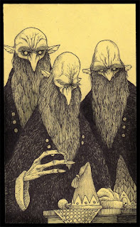
 Not quite keeping to my blog post a day but that's not to mean I'm not doing the research, I'm just not posting about it! So I came across this little blog by a childrens tv director John Kenn. It's a rather self indulgent project, where he draws scenes of the creepy and weird, of monsters and giants but fits it all into the small viewing window of a Post it note. Its not the style nor substance of the drawings that really catches my eye, despite them being rather commanding, it is his use of composition, in that each image really feels like a little window into a weird world.
Wednesday, 2 February 2011
Need to post it!
 Not quite keeping to my blog post a day but that's not to mean I'm not doing the research, I'm just not posting about it! So I came across this little blog by a childrens tv director John Kenn. It's a rather self indulgent project, where he draws scenes of the creepy and weird, of monsters and giants but fits it all into the small viewing window of a Post it note. Its not the style nor substance of the drawings that really catches my eye, despite them being rather commanding, it is his use of composition, in that each image really feels like a little window into a weird world.
Thursday, 27 January 2011
Sometimes it's good to show your seams!
Found a rather charming animation with a wicked combination of elements. what I liked most about it though, was that it wasn't afraid to show its seams (oh tehe, I love bad pun times), but in all seriousness, they could have slaved away and made this into a stop motion where you didn't see their hands but I really like that you can, it gives it a sense of fun that they are playing with these sack boys instead of just animating them and so really it brings out the context of their character for me!
Found via (toplesrobot)
A little chuckle was had

So this is an Older illustration, circa 2006 By Piven for The Times magazine. What catches my eye is Pivens sense of fun and strong ability to play with multiple dimensions and media to create strikingly effective, collaged caricatures, while infusing the work with his own personality and refraining from the grotesque that over stylised Caricature illustration seems to pigeon hole itself as in my mind.
Tuesday, 25 January 2011
An Important Self Reminder.
 A piece of work came to my attention a few days ago, that really captures the essence of a recent epiphany, this piece by Onesidezeront . The message itself is a rather serious one, in that as a creative mind we should use our own voice and celebrate our own voice rather than copy other or berate ourselves for not being like others. That individuality within creativity is the core component to effective communication, well that's my perspective anywho!
 What really pushes this image for me, is its self indulgence, it feels clear to me that despite the message its portraying being one of an honest and serious nature, the illustrator has infused his personality and playfulness into it whilst still keeping the type clean, bringing about the impression that its something the illustrator takes as a sort of personal mantra and like my self has had to repeat more than a few times.
Friday, 21 January 2011
Thursday, 20 January 2011
Hello Haiku
Wanting To Create
New Paths For A Cluttered Mind
How Do I Haiku?
The Heart Wrapped in snow
Tackled By A Summers Sky
The Rumble Brings Warmth!
Why not huh, these are actually my first ever attempts but I felt I wanted to voice how I'm feeling, without rant or preach!
Yoda
Subscribe to:
Comments (Atom)


